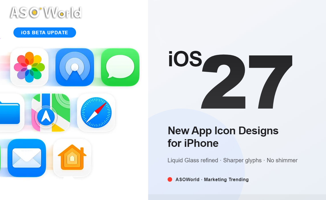

Apple seeded the first iOS 27 developer beta on June 8, 2026, immediately after the WWDC 2026 keynote — and the first thing testers noticed has nothing to do with AI. It is the app icons. Many built-in iPhone apps now sport revised glyphs that look sharper, more detailed, and noticeably calmer than the Liquid Glass icons introduced in iOS 26. For iOS app developers and app marketers, this quiet redesign is the most consequential App Store-adjacent change of the cycle.
Key Takeaways
- iOS 27 beta 1 ships a refined app icon set for most first-party Apple apps.
- The new icons sit between iOS 18 clarity and iOS 26 gloss — sharper glyphs, cleaner edges, better legibility.
- The shimmering motion effect introduced with iOS 26 has been removed.
- A small number of system apps remain on the older iOS 26 treatment, suggesting more updates are coming through the beta cycle.
- For app marketers, this resets Home Screen aesthetics and icon CTR benchmarks for the next 12 months.
What Changed in the iOS 27 App Icons
According to 9to5Mac's hands-on with beta 1, Apple has gone back into the Liquid Glass icon library introduced last year and revised many of them. The redesign is evolutionary, not revolutionary — but the differences are visible at a glance on the Home Screen.
1. Sharper, more detailed glyphs
One of the most common complaints about iOS 26's icons was that they looked subtly blurry or over-glossed — an artifact of the Liquid Glass material refracting the central glyph. In iOS 27, the glyphs are tightened up: thicker strokes where needed, crisper edges, and stronger central contrast. The result lands somewhere between the flat clarity of iOS 18 and the layered translucency of iOS 26.
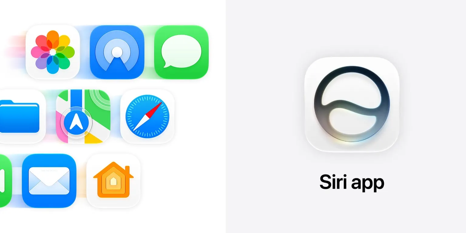
image credit: 9To5Mac
2. The shimmering motion effect is gone
iOS 26 famously added a subtle shimmer animation that played across icons as you tilted the device — a showcase for the Liquid Glass material. In iOS 27 beta 1, that effect has been completely removed. The Home Screen now feels noticeably calmer and less performative, which matches the broader "stability and refinement" framing of this release.
3. Most first-party apps updated, with exceptions
The redesigns cover a wide spread of Apple-developed apps — including familiar Home Screen staples — while a small number remain unchanged for now. Given that this is only beta 1, expect additional icons to fall in line over the coming developer and public betas.
4. A more readable Liquid Glass
Liquid Glass itself has not gone away. Icons still use the translucent, layered material that defined iOS 26's identity. What Apple appears to have done is dial back the gloss and increase the contrast of the glyph layer so that icons read cleanly at any size — from the Home Screen to Spotlight to the App Library.
Why This Matters Beyond Aesthetics
App icons are not just decoration. They are the single most-viewed creative asset for any iOS app — appearing on the Home Screen, the App Store product page, search results, notifications, and Spotlight. When Apple shifts the system aesthetic, every third-party icon gets visually re-benchmarked against the new neighbors.
iOS 26 pushed icons toward heavier gloss; many third-party teams responded with bolder, more reflective designs to match. iOS 27 quietly walks that back. The icons that looked perfectly tuned six months ago may now read as slightly louder than the surrounding system icons.
What iOS App Developers Should Do in Beta 1
- Rebuild your icon against the iOS 27 SDK in Xcode 27 beta and check rendering on a device running beta 1.
- Test light, dark, and tinted modes. Sharper glyphs change how tinting reads, especially for icons with dense central artwork.
- Verify legibility at small sizes — Spotlight, notifications, the App Library, and the Dynamic Island app switcher.
- Drop motion-based icon tricks that mimicked the iOS 26 shimmer; they will now feel out of place.
- File feedback early. If a rendering issue is reproducible in beta 1, it has the best chance of being addressed before the fall release.
What iOS App Marketers Should Do
- Refresh your icon A/B tests. Use Apple's Product Page Optimization (PPO) to compare a sharper, higher-contrast variant against your current iOS 26 icon.
- Re-shoot or re-render screenshots that include system chrome or Home Screen mockups so they match the iOS 27 look on your App Store listing.
- Reset your icon CTR benchmarks. Expect category-wide shifts in tap-through as the public beta rolls out in July and the stable release ships in fall 2026.
- Plan a refresh window around the public release to capture the natural traffic spike that follows every major iOS launch.
Frequently Asked Questions
What changed about app icons in iOS 27?
Many first-party Apple app icons have been redesigned to look sharper and more detailed than their iOS 26 versions. The shimmering motion effect that played when tilting the device has been removed, producing a calmer Home Screen.
Is Liquid Glass gone in iOS 27?
No. Liquid Glass remains the system design language. Apple has refined it — tightening glyphs, increasing contrast, and removing the shimmer — rather than replacing it.
Do third-party apps need to update their icons?
It is not mandatory, but recommended. Icons designed against iOS 26's glossier look may now feel mismatched next to the sharper iOS 27 system icons. A/B testing a refreshed variant before the fall release is the safe play.
When will the new icons reach all users?
Developer beta 1 is available now (June 8, 2026). A public beta is expected in July 2026, with the stable iOS 27 release in fall 2026.

 Follow Us on Facebook